Exploring “H”
This project’s goal was to explore a chosen letterform and create 35 finalized iterations arranged in a specific poster layout. Each row needed a theme, and each form required a number and unique name. It was encouraged to take into consideration the letter’s typographic anatomy.
DESIGN PROCESS
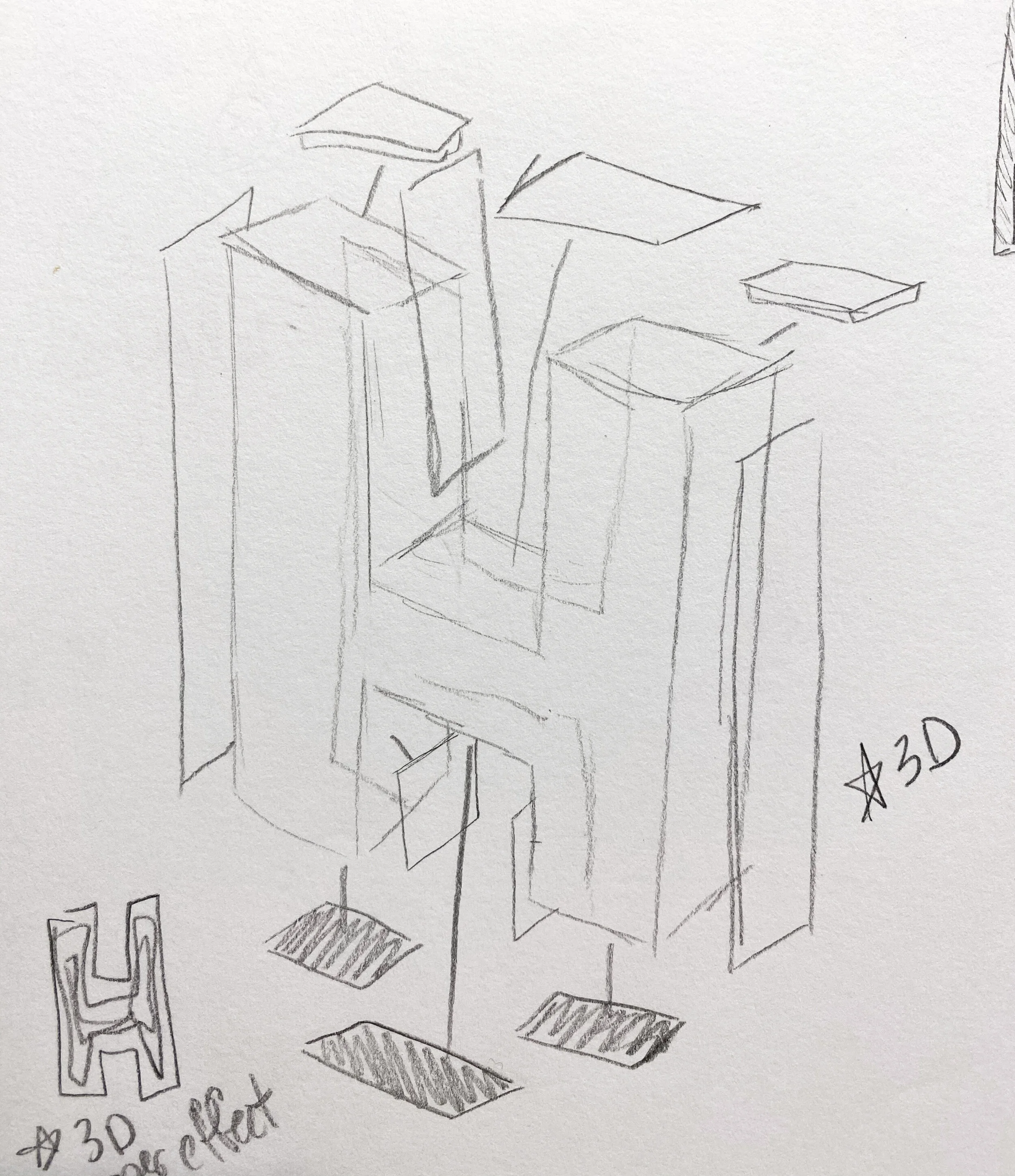
After a good bit of letterform research, to get myself in a creative state of mind, I started with a pencil and a sketchbook. I aimed to hit 100 different sketches of “H” before even touching an Adobe program.
In order to gain inspiration, I started brainstorming possible themes for my rows. Instability, legibility, depth, motion, food, geometry, etc. Having these categories made it much easier to come up with plenty of ideas!
After selecting my favorites of the 100, I started recreating my designs in Illustrator. I deciphered which ones translated to a digital format the best, and then I narrowed them down to the final 35. I chose a CMYK color palette to ensure that the various forms would remain cohesive when arranged together.
OUTCOME
The themes of the rows are: boldness, lines, instability, dimensional, stability, artistic mediums, and illustrative dragons.


